Every successful chartist I’ve ever come across has a favorite pattern they love to trade.
For me, it puts the ‘P’ in my TPS setup.
However, like a piece of abstract art, show two traders a chart, and they’re likely to tell you about two different patterns they see.
What can I say, charting is both an art and science.
For years I struggled with accepting that.
I wanted to be perfect in identifying chart patterns. That is until I realized something profound…
…Perfection was holding me back!
You don’t need to be perfect at pattern recognition— just good enough.
All chart patterns boil down to three types: reversal, continuation, and consolidation.
That’s where my epiphany came in…
Table of Contents
Describing Chart Patterns
Each of the three types of patterns works with some element of price and movement in the chart. The easiest way to think of them is like your middle school physics class.
Imagine I hold a rubber ball in my hand. If I throw that ball in the air, at some point, it slows down. Then it stops and drops. Or, imagine that I bounce it off the ground. It ricochets and comes back towards my hand. Essentially, that’s what happens with reversal patterns.
You describe reversal patterns the same way you would describe throwing that ball. Most reversal bottoms are marked by violent, ‘V’ shaped turns that require a lot of force. Conversely, most tops arc on softer energy before reversing.
The ball analogy is meant to help you visualize how to describe the actions of the stock movement (not to be an exact analogy). That’s how we fit chart patterns into the three categories.
So let’s start with reversal patterns.
Reversal Patterns
Most reversal patterns contain two major elements:
- Support or resistance level
- Candlestick pattern/formation
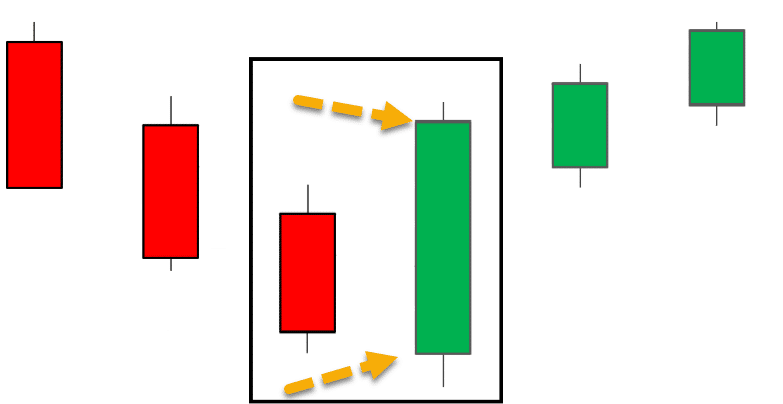
A common reversal pattern is an engulfing candle, and one I’ll use for demonstration purposes. This occurs when one candle’s body encompasses the whole of the previous candle.
This is what it would look like for a reversal off the bottom.

The green candle engulfs the previous candle. This is a signal that price wants to reverse. However, this doesn’t make sense at any arbitrary point in the chart. Let’s say this particular bullish reversal occurred near the highs. Does that make sense?
Not really. Why would a stock need to reverse when it’s near the highs? These patterns only make sense in context. So, this pattern should only work when reversing a downtrend.
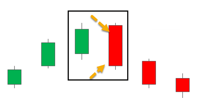
This is what the pattern would look like at a top for a reversal.

Looks like the same image with the colors flipped and the image upside down.
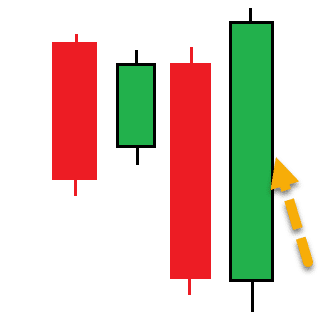
Now, here’s a slight variation. This is still a bullish engulfing pattern.

It looks a lot different than the other two. But, let’s describe what’s really going on here.
- The primary candle’s body ‘engulfs’ the previous candle’s body.
- It reverses a trend
- The pattern only makes sense in context.
That’s really it. Everything else is just noise. Don’t make things more complicated than they already are.
Continuation Patterns
Think of continuation patterns like you were throwing the ball to someone who was standing at the top of the stairs. When you throw the ball, it goes over their head a little bit. Then they catch it and get ready to throw it again.
Basically, that’s a continuation pattern. These patterns look for areas of ‘rest’ within a chart. They take a trend that already exists and give it a chance to catch a breather.
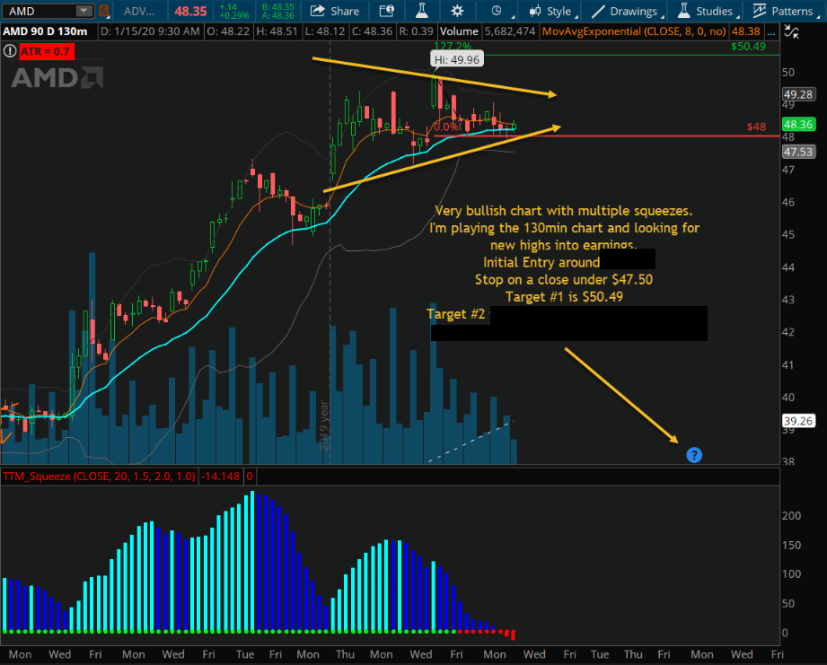
I use continuation patterns all the time in my TPS setups. Let me give you an example.
Here’s a trade I recently took in AMD.

AMD 130-Minute Chart
I want you to focus on the two orange lines forming a ‘triangle.’ This is a common chart pattern for consolidation. In fact, most consolidation patterns work off some sideways action and a compression in the trading range.
However, the context here is important. The continuation pattern only works if it’s continuing a trend. If I try to play this in a choppy chart, it’s bound to fail. That’s because, like a bullish reversal near the highs, it doesn’t make sense.
Consolidation Patterns
I won’t spend too much time on consolidation patterns as they don’t have a lot of definition around them, and are mainly setups to other price action. But, think of them as a broad category for stocks that trade in a range.
Consolidation patterns mean that the stock has stopped moving in a trend and remains in a range. This range can be expanding or compressing.
Continuation patterns can be consolidation patterns. If you look at the AMD triangle pattern, it’s certainly a consolidation pattern. However, not all consolidation patterns are continuation patterns.
Traders I know that work with consolidation patterns tend to play ranges. They work with stocks that bounce back and forth. Consolidation patterns themselves are a bit easier to understand in the right context. But, when you find one in a choppy chart, it’s hard to say whether it’s changing or continuing a trend.
My advice, unless you’re already good with these, stick to the other two.
Incorporate Patterns Into Your Strategy
Earlier, I referred to my TPS setup. You probably noticed that pattern makes up only one aspect, the other two being a trend and squeeze in price.
I created this system after analyzing charts and working through my journal for the better part of a decade.
In the end, I turned $38,000 into over $2,000,000 in two years. You can learn about the steps I went through in a recent training session. I explain how I went from an unprofitable trader to a RagingBull guru.
Source: Weeklymoneymultiplier.com | Original Link